Description
SPECIFICATIONS
About this item
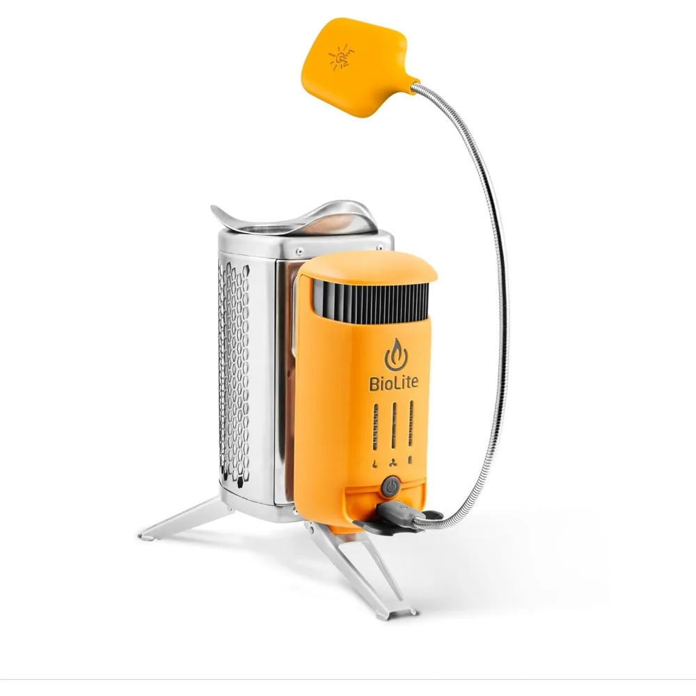
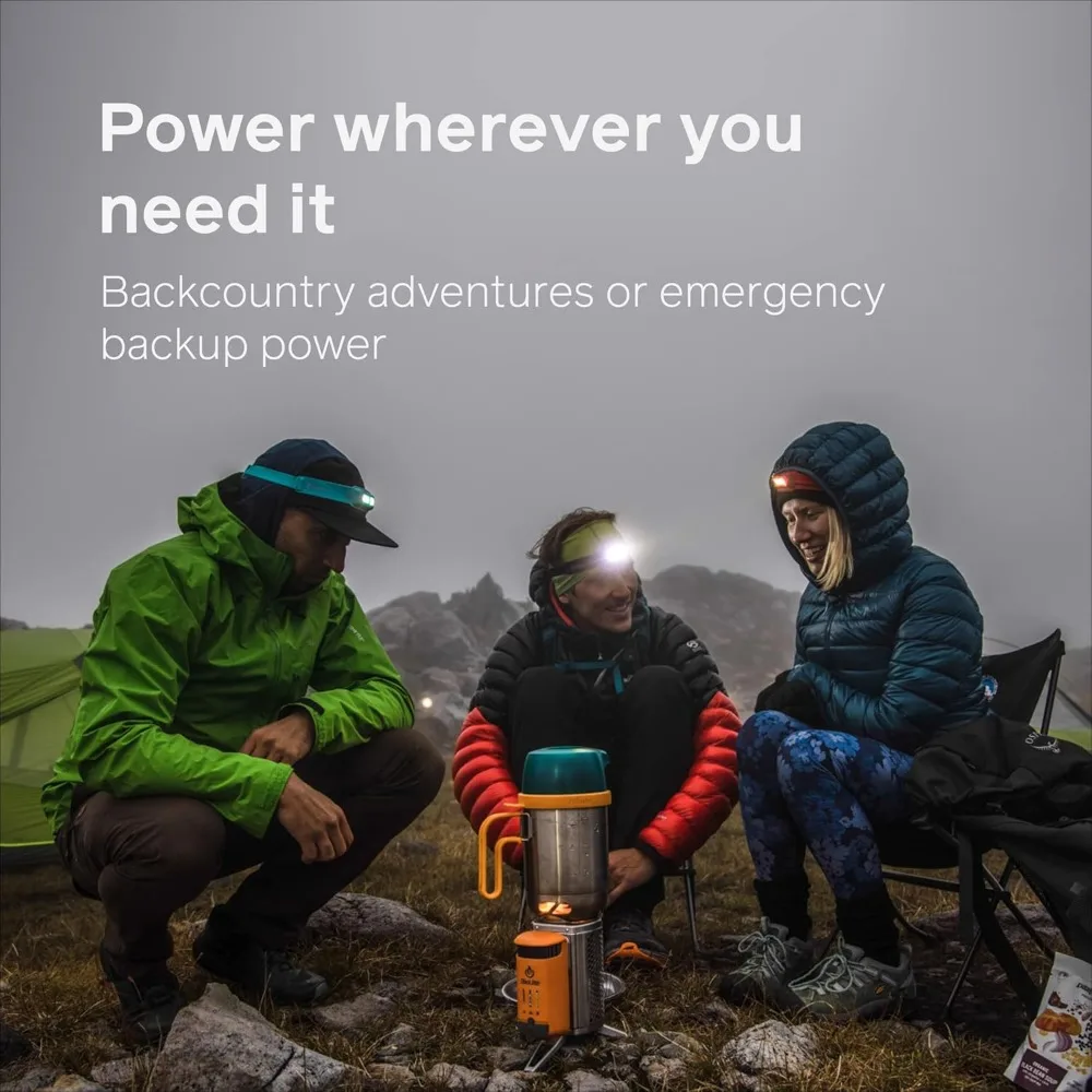
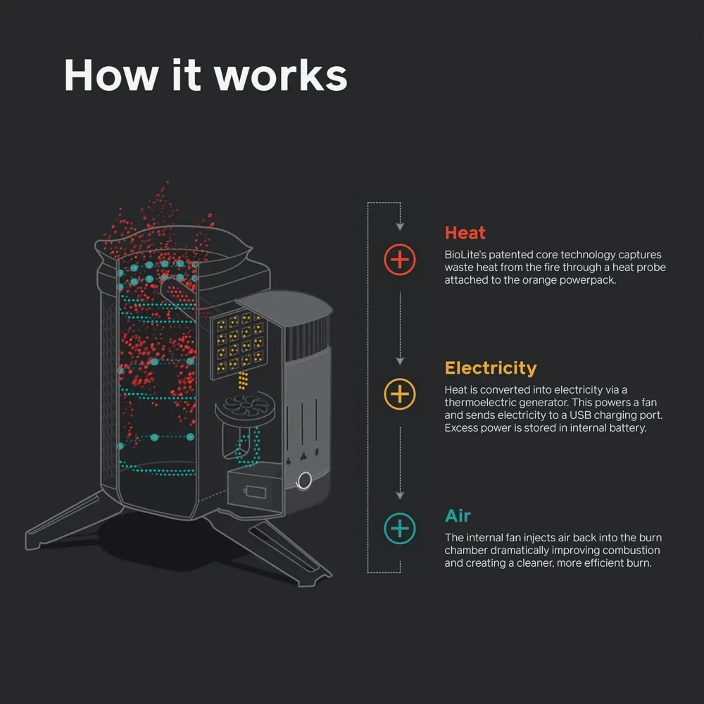
- Camping stove fueled by sticks, wood scraps or pellets creates fire for cooking and boiling water, and converts heat into electricity to charge smartphones and headlamps for camping, backpacking, and survival situations
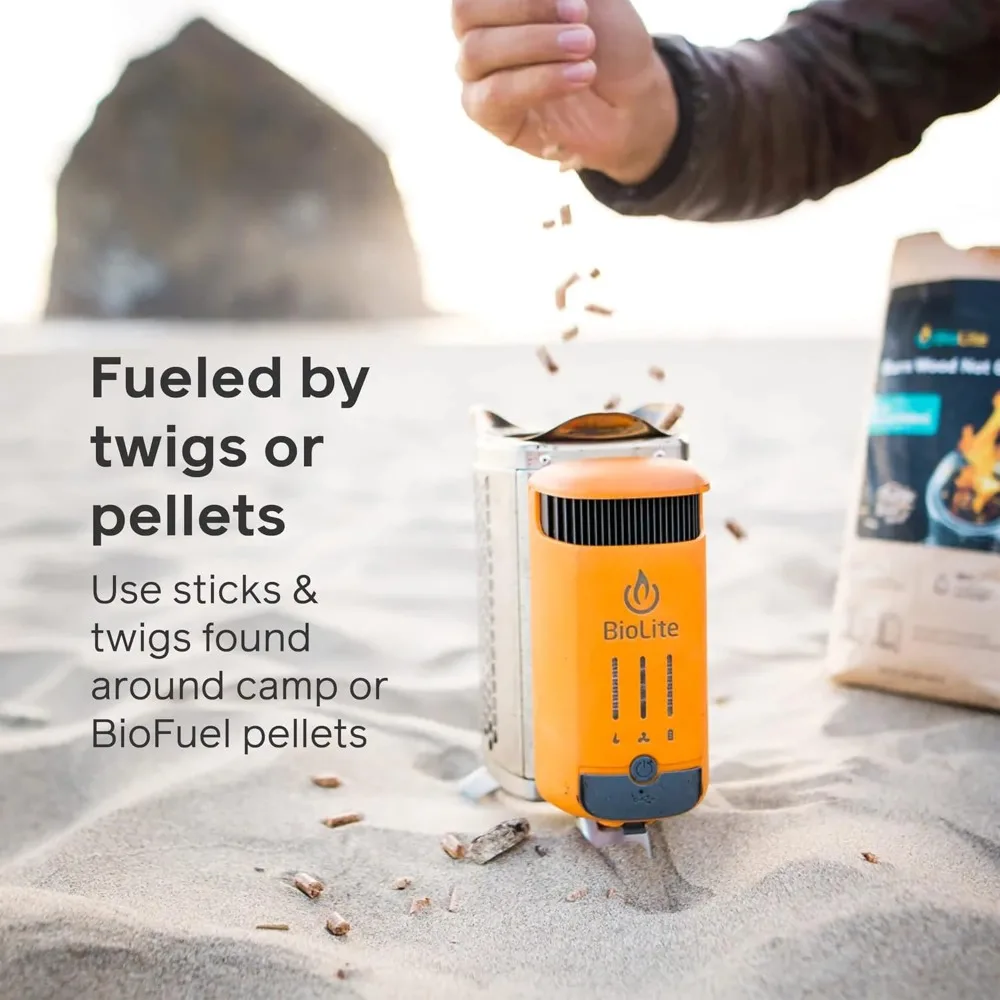
- Renewable biomass fuel such as twigs, sticks, pinecones, and other forest floor debris is readily available and eliminates reliance on gas canisters; patented combustion technology creates smokeless flames for tabletop fire that makes everything from s’mores to complete meals
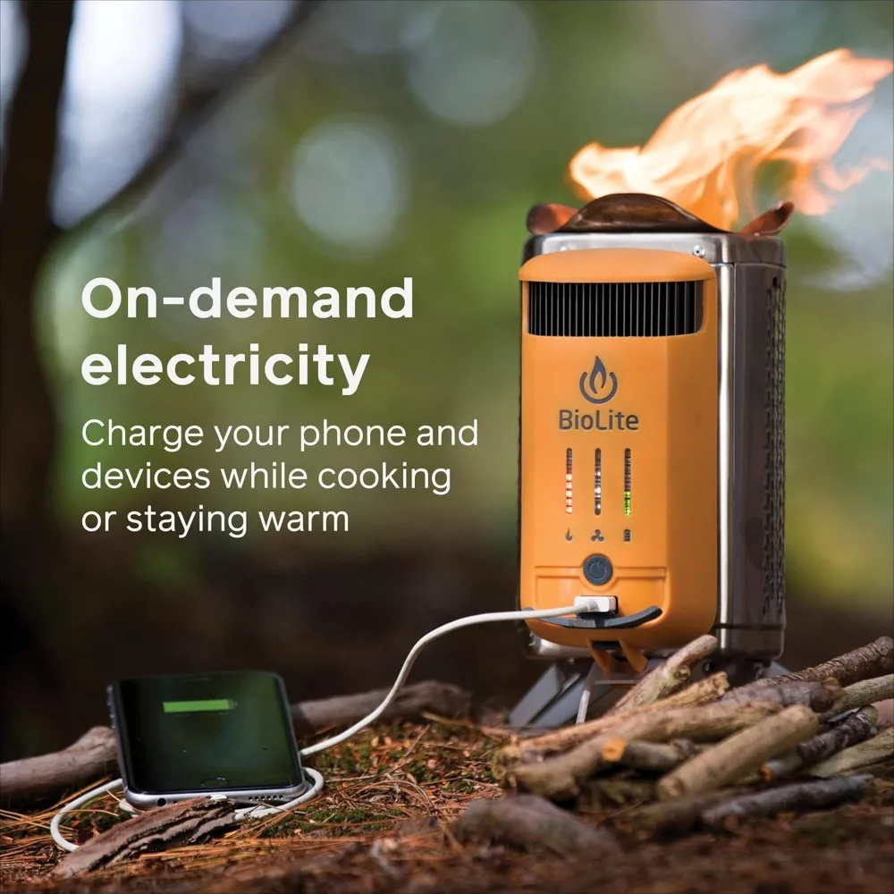
- Devices can be charged via the integrated USB port; thermoelectric generator generates 3 watts of power for real-time charging, and stores power in the 3,200 mAh battery for use even when fire isn’t burning
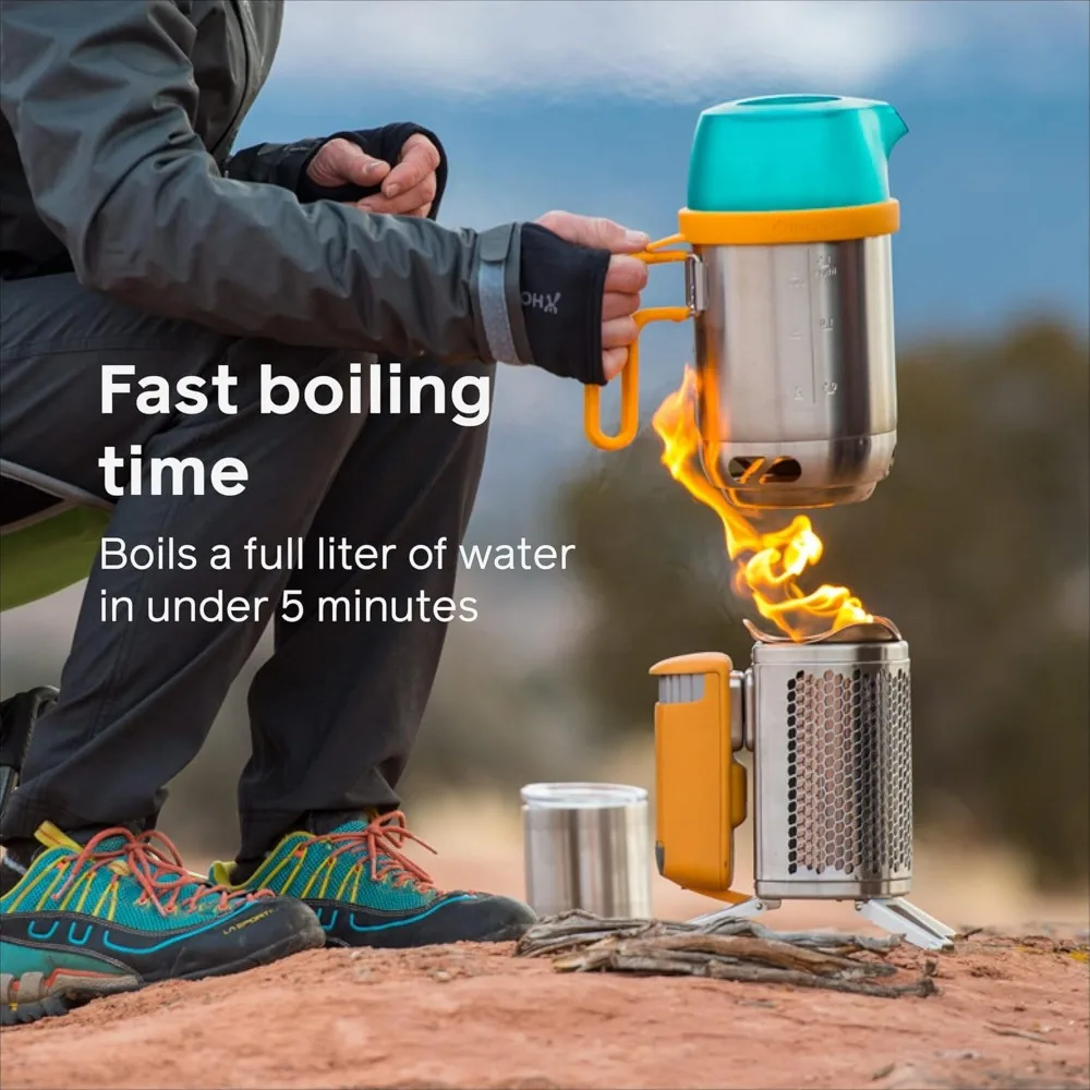
- Scalloped pot stand holds cookware and folding legs provide stability; boils 1 liter of water in 4.5 minutes and adjustable flame can be controlled with 4 fan speeds
- CampStove packs down the size of a 32-ounce wide-mouth water bottle (5 x 8 inches) and weighs 2.06 pounds; includes a 100 lumen LED FlexLight to light surroundings, stuff sack, Firestarter, and USB cord


#productDescription h3 {
margin: 0.75em 0px 0.375em -1px;
}
.aplus-v2 .apm-brand-story-carousel-container {
position: relative;
}
.aplus-v2 .apm-brand-story-carousel-hero-container,
.aplus-v2 .apm-brand-story-carousel-hero-container > div {
position: absolute;
width: 100%;
}
/*
Ensuring the carousel takes only the space it needs.
The sizes need to be set again on the absolutely positioned elements so they can take up space.
*/
.aplus-v2 .apm-brand-story-carousel-container,
.aplus-v2 .apm-brand-story-carousel-hero-container {
height: 625px;
width: 100%;
max-width: 1464px;
margin-left: auto;
margin-right: auto;
overflow: hidden;
}
/*
This centers the carousel vertically on top of the hero image container and after the logo area (125px).
Margin-top = (heroHeight – cardHeight – logoAreaHeight) / 2 + logoAreaHeight
*/
.aplus-v2 .apm-brand-story-carousel .a-carousel-row-inner{
margin-top: 149px;
}
/*
Cards need to have a width set, otherwise they default to 50px or so.
All cards must have the same width. The carousel will resize itself so all cards take the width of the largest card.
The left margin is for leaving a space between each card.
*/
.aplus-v2 .apm-brand-story-carousel .a-carousel-card {
width: 362px;
margin-left: 30px !important;
}
/* styling the navigation buttons so they are taller, flush with the sides, and have a clean white background */
.aplus-v2 .apm-brand-story-carousel .a-carousel-col.a-carousel-left,
.aplus-v2 .apm-brand-story-carousel .a-carousel-col.a-carousel-right {
padding: 0px;
}
.aplus-v2 .apm-brand-story-carousel .a-carousel-col.a-carousel-left .a-button-image,
.aplus-v2 .apm-brand-story-carousel .a-carousel-col.a-carousel-right .a-button-image {
border: none;
margin: 0px;
}
.aplus-v2 .apm-brand-story-carousel .a-carousel-col.a-carousel-left .a-button-image .a-button-inner,
.aplus-v2 .apm-brand-story-carousel .a-carousel-col.a-carousel-right .a-button-image .a-button-inner {
background: #fff;
padding: 20px 6px;
}
.aplus-v2 .apm-brand-story-carousel .a-carousel-col.a-carousel-left .a-button-image .a-button-inner {
border-radius: 0px 4px 4px 0px;
}
.aplus-v2 .apm-brand-story-carousel .a-carousel-col.a-carousel-right .a-button-image .a-button-inner {
border-radius: 4px 0px 0px 4px;
}
.aplus-v2 .aplus-review-right-padding {
padding-right: 0.1rem;
}
.aplus-v2 .aplus-review-right-padding {
padding-right: 0.1rem;
}
.aplus-v2 .aplus-review-right-padding {
padding-right: 0.1rem;
}
Reviews
There are no reviews yet.